Introduction
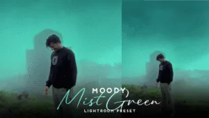
Color is one of the most powerful tools in photography. Whether you’re creating a warm sunset look or a cool cinematic edit, color grading makes all the difference. Adobe Lightroom has evolved over the years, and one of its most game-changing additions is the Color Grading Wheel, also known as the Color Wheel.
In this article, we’ll explore:
- What the Lightroom Color Wheel is
- How it differs from Split Toning
- How to use it effectively
- Pro tips for stunning edits
- Common mistakes to avoid
Let’s dive into the world of creative color grading!
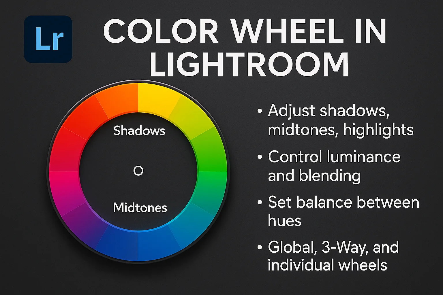
What is the Color Wheel in Lightroom?
The Color Wheel in Lightroom is a feature found under the Color Grading panel. It allows photographers and editors to apply different hues and saturations to the shadows, midtones, and highlights of an image.
Quick Breakdown:
- Shadows: Darker parts of the image
- Midtones: Neutral brightness areas
- Highlights: Brightest parts of the image
Each of these sections has its own wheel. You can also control:
- Luminance (brightness of the tone)
- Blending (how tones mix together)
- Balance (how shadows and highlights interact)
This makes the Color Wheel an incredibly powerful and flexible tool for color grading and creating cinematic effects.
Where to Find the Color Wheel in Lightroom
To use the Color Wheel:
- Open Adobe Lightroom (Classic or CC)
- Go to the Develop module
- Scroll down to the Color Grading panel
- You’ll see three wheels for Shadows, Midtones, and Highlights.
Or, choose 3-Way View to edit all at once.
You can also click on the Global wheel to apply color to the entire image.
Lightroom Color Wheel vs. Split Toning
Before the Color Grading Wheel, Lightroom had Split Toning, which allowed users to color only shadows and highlights. While useful, it was limited.
Color Wheel = Advanced Split Toning
Now, with Midtones, more precise luminance control, and blending options, you get far more control and creativity.
How to Use the Lightroom Color Wheel
Let’s walk through how to create a cinematic color grade using the wheels.
Step 1: Start With Shadows
- Click on the Shadows wheel
- Drag the center point to your desired hue
- Use the outer circle to adjust saturation
- Adjust Luminance slider below if needed
🟣 Example: Add a teal or blue shade to shadows for a “cool” look
Step 2: Add Color to Highlights
- Click on the Highlights wheel
- Try warmer colors like orange or yellow
- This creates the popular “teal & orange” look
🟠 Great for travel or outdoor portraits
Step 3: Tweak Midtones
- Midtones control the overall color mood
- Use subtle adjustments here
- You can shift toward warmer or cooler tones depending on the look you want
Step 4: Adjust Balance and Blending
- Blending: Controls how much the tones mix
- Low = separate tones
- High = smoother transition
- Balance: Moves emphasis between shadows and highlights
🧠 Tip: Keep an eye on the image. Too much color in all three areas can ruin the natural feel.
When to Use the Color Wheel
- Portraits: Add warmth to skin or cinematic depth
- Landscapes: Balance the coolness of skies with warm sun tones
- Street Photography: Use moody tones for a dramatic effect
- Cinematic Videos or Stills: Create teal & orange Hollywood style
Pro Tips for Stunning Color Grading
🎯 1. Use Reference Images
Have a favorite look? Import a reference photo and match the tones using the Color Wheel.
🎯 2. Don’t Overdo It
Subtle color grading looks more professional. Heavy saturation can look fake or overedited.
🎯 3. Play with Luminance
Sometimes, just increasing the luminance of midtones gives a fresh, airy look.
🎯 4. Combine with HSL and Curves
Use HSL for specific color tuning and Tone Curves for contrast. The Color Wheel works best when combined with these tools.
🎯 5. Save Color Grading Presets
Once you love a look, create a preset so you can reuse it across other photos.
Common Mistakes to Avoid
❌ Oversaturating All Wheels: If you add strong color to shadows, midtones, and highlights all at once, the image becomes muddy.
❌ Ignoring Luminance: Many people skip this. But luminance adds brightness control which changes the whole vibe.
❌ Not Checking Skin Tones: If you’re editing portraits, ensure skin tones stay natural even after grading.
Best Lightroom Color Grading Styles to Try
Here are some fun looks you can try using the Color Wheel:
🔥 Teal & Orange (Hollywood Look)
- Shadows: Teal
- Highlights: Orange
- Midtones: Slight warm tint
- Blending: High
- Balance: Neutral
🧊 Cool Winter Look
- Shadows: Blue
- Midtones: Light Blue
- Highlights: Neutral or White
- Luminance: Lower for shadows
🌄 Warm Golden Hour
- Shadows: Purple or Red
- Highlights: Orange-Yellow
- Midtones: Soft Pink
🎞️ Moody Cinematic
- Shadows: Dark Blue
- Midtones: Desaturated
- Highlights: Slight yellow
- Luminance: Reduce shadows for drama Lightroom Color Wheel
Final Thoughts
The Lightroom Color Wheel is more than just a feature—it’s a creative powerhouse. Whether you’re an Instagram creator, professional photographer, or casual editor, learning to master this tool will elevate your edits to the next level.
It allows you to control mood, tone, emotion, and atmosphere with just a few subtle tweaks. Practice regularly, experiment with new styles, and soon you’ll develop your own signature color grading style.